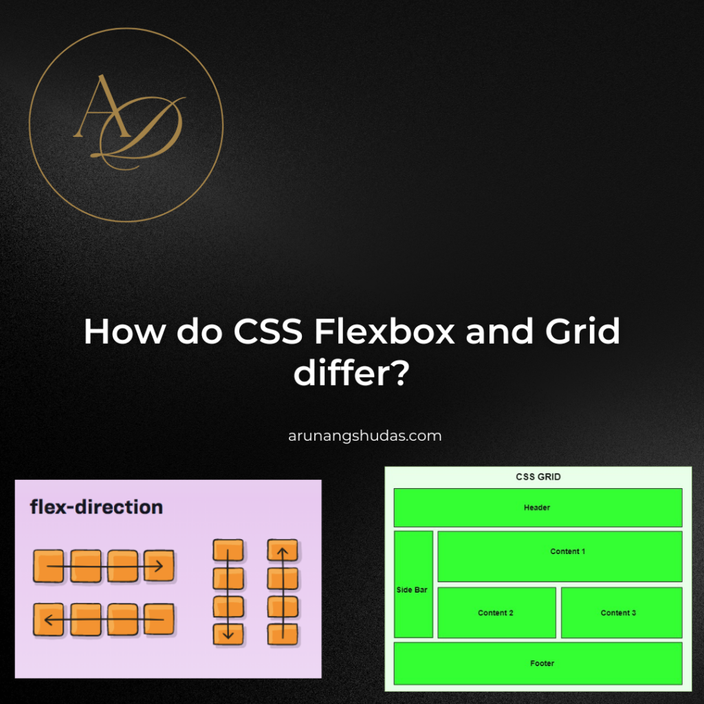
When it comes to creating responsive, organized, and visually appealing layouts in web development, CSS Flexbox and Grid are two powerful layout models that every developer should know. Both Flexbox and Grid are modern CSS layout systems, each with unique strengths, applications, and design approaches. While they can be used together in many cases, understanding how they differ is crucial for choosing the best layout solution for each part of your project. In this blog post, we’ll explore the differences between Flexbox and Grid, diving into their respective structures, use cases, benefits, limitations, and practical examples.
What is CSS Flexbox?
CSS Flexbox, or the Flexible Box Layout, is a one-dimensional layout model designed for aligning items in rows or columns. Flexbox was introduced to handle layouts where space distribution between items within a container is crucial, and it simplifies the creation of complex layouts by adjusting elements based on screen size and available space.
Key Features of Flexbox:
- One-Dimensional Layout: Flexbox is built for one-dimensional layouts, meaning it can align items along either a row or a column.
- Flexible and Responsive: Flexbox can automatically adjust the alignment, distribution, and sizing of items within a container.
- Dynamic Alignment: With Flexbox, you can control the alignment of items along the main axis (row or column) and the cross axis (the perpendicular direction).
Syntax Example: Here’s a basic example of Flexbox in action:
					.container {
  display: flex;
  justify-content: space-between;
  align-items: center;
}
In this example:
display: flexmakes the container a Flexbox container.justify-content: space-betweendistributes space between items along the main axis.align-items: centercenters the items along the cross axis.
What is CSS Grid?
CSS Grid, also known simply as Grid, is a two-dimensional layout model that allows developers to control layouts along both rows and columns. Grid excels in complex layouts where both dimensions (rows and columns) need to be managed simultaneously, such as for the overall structure of a webpage with multiple sections.
Key Features of Grid:
- Two-Dimensional Layout: Unlike Flexbox, CSS Grid is designed for two-dimensional layouts, which makes it ideal for creating full-page or section layouts that need to span across both rows and columns.
- Explicit Positioning: Grid offers precise control over element placement, allowing developers to define exactly where each item should appear within a grid.
- Flexible and Responsive: Similar to Flexbox, Grid can adapt to various screen sizes, making it excellent for responsive design.
Syntax Example: Here’s a simple example of a Grid layout:
					.container {
  display: grid;
  grid-template-columns: repeat(3, 1fr);
  grid-template-rows: auto;
}
In this example:
display: gridmakes the container a Grid container.grid-template-columns: repeat(3, 1fr)creates three equal-width columns.grid-template-rows: autoautomatically determines the row height based on content.
Comparing Flexbox and Grid: Key Differences
While both Flexbox and Grid are designed to help developers manage layouts, their primary differences lie in their intended usage, dimensional focus, and syntax. Let’s break down these differences in detail.
1. Dimension Focus
- Flexbox: One-dimensional. You can use Flexbox to align items horizontally (in a row) or vertically (in a column) but not both simultaneously.
- Grid: Two-dimensional. Grid lets you define layouts in both rows and columns, allowing more control over item positioning in two directions.
2. Primary Use Cases
- Flexbox: Flexbox is best suited for smaller components and single-axis layouts, such as navigation bars, cards, buttons, and forms.
- Grid: Grid is ideal for larger-scale layouts, such as page layouts, image galleries, or complex web pages that require both horizontal and vertical alignment.
3. Layout Control and Item Alignment
- Flexbox: Flexbox has better support for alignment within a container, providing powerful properties like
justify-content,align-items, andalign-selfto control spacing and alignment. - Grid: Grid offers precise control over the entire layout through grid-template properties like
grid-template-rows,grid-template-columns, andgrid-template-areas.
4. Implicit vs. Explicit Placement
- Flexbox: Flexbox places items along a single line by default, but they can wrap onto multiple lines if specified. Flexbox relies on content flow rather than fixed positioning.
- Grid: Grid allows you to explicitly define rows and columns and control exactly where items are placed within the grid using grid line numbers or grid areas.
5. Responsive Design Approaches
- Flexbox: Flexbox is inherently flexible, making it easy to create responsive layouts without media queries. Flex items adjust dynamically based on available space.
- Grid: While Grid also supports responsiveness, it may require more use of media queries for complex layouts. Grid offers the
fr(fractional) unit and theminmax()function for flexible designs.
Practical Examples: When to Use Flexbox vs. Grid
Here are some common scenarios and guidance on whether to use Flexbox or Grid.
Example 1: Navigation Bar
For a horizontal navigation bar where items are aligned in a single row and need to be evenly spaced, Flexbox is the ideal choice:
					.navbar {
  display: flex;
  justify-content: space-around;
}
Example 2: Image Gallery
For a responsive image gallery with multiple rows and columns, CSS Grid is more suitable:
					.gallery {
  display: grid;
  grid-template-columns: repeat(auto-fit, minmax(150px, 1fr));
  gap: 10px;
}
Example 3: Card Layout
A grid of cards where each row has an equal number of cards and adapts to the screen size can be done effectively with either Flexbox or Grid. Here’s an example using Grid:
					.card-container {
  display: grid;
  grid-template-columns: repeat(3, 1fr);
  gap: 20px;
}
If the number of items or columns is more dynamic, Flexbox may be the better option.
Can Flexbox and Grid Be Used Together?
Absolutely! Flexbox and Grid can be used together to create complex layouts. For example, you might use Grid to create the main layout of a page and Flexbox within each section to align smaller items. This combination provides flexibility and precise control over both the larger layout and smaller elements.
Here’s a practical example:

					/* Page Layout */
.page-layout {
  display: grid;
  grid-template-columns: 1fr 3fr;
  gap: 20px;
}

/* Navbar within the header */
.navbar {
  display: flex;
  justify-content: space-around;
}
In this example:
- The
.page-layoutuses Grid to define two main columns. - The
.navbarinside the header section uses Flexbox to space out navigation links.
Pros and Cons of Flexbox and Grid
Flexbox Pros
- Easy to create responsive designs with minimal CSS.
- Powerful for alignment and distribution along a single axis.
- Great for smaller components.
Flexbox Cons
- Limited to one-dimensional layouts, making it difficult to create complex grid-based layouts.
- Less intuitive for complex multi-row or multi-column layouts.
Grid Pros
- Perfect for two-dimensional layouts that require both row and column control.
- Allows for precise placement of items within the layout.
- Great for designing full-page layouts.
Grid Cons
- Can be more complex to use for simple alignment tasks.
- Often requires more code, especially for responsive designs.
Conclusion
CSS Flexbox and Grid are two indispensable layout tools for modern web design. While Flexbox is ideal for one-dimensional layouts and smaller UI components, Grid shines in two-dimensional layouts and larger-scale page structures. Both tools make responsive design more accessible, but choosing the right one depends on the layout requirements, dimensions involved, and complexity of the task at hand. By mastering both Flexbox and Grid, you’ll be well-equipped to create efficient, flexible, and visually appealing layouts for a wide range of web projects.

Trust me, I’m a software developer—debugging by day, chilling by night.


