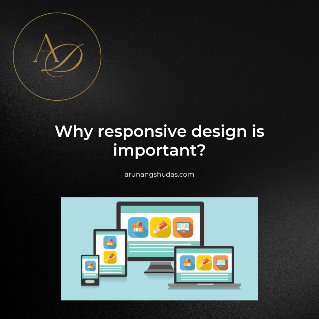
In an increasingly digital world where users access websites from a myriad of devices—smartphones, tablets, laptops, desktops, and even smart TVs—the importance of responsive design cannot be overstated. Responsive design is the approach to web development that allows a website to adjust seamlessly to different screen sizes and orientations. By creating a site that adapts to various devices, designers ensure that every visitor enjoys a consistent and optimized experience.
What Is Responsive Design?

Responsive design is a web design strategy that enables websites to render well on different screen sizes, orientations, and resolutions. In simple terms, responsive design makes a website look and function well on all devices. The design, content, and functionality dynamically adapt to the screen dimensions, meaning users on a mobile device can access the same site as desktop users but see it arranged in a more accessible format.
The term “responsive” essentially means that the layout “responds” to the needs of the device it’s being viewed on. This is different from adaptive design, which involves creating separate layouts for different devices. In contrast, responsive design uses a single layout that can adjust to fit any screen, making it more flexible and efficient.
Key Elements of Responsive Design
There are several core techniques used to achieve responsive design:
Fluid Grids: Traditionally, web pages were built on fixed-width layouts, but responsive design requires a flexible, grid-based approach. Fluid grids divide the page into a flexible number of columns, allowing content to reflow based on screen size. Rather than using fixed pixel sizes, designers use percentages or relative units like
emandremto size elements, making them proportional to the screen’s width.Flexible Images and Media: Images and videos are also scaled to fit different screen sizes. Instead of using fixed image sizes, responsive design often employs relative sizing, like setting the
max-widthto 100%, so media will resize within its container without stretching or distorting.CSS Media Queries: Media queries are a critical component of responsive design, allowing the website to apply different styles based on the device’s characteristics, such as screen width, resolution, and orientation. For instance, a media query can detect if a visitor is on a tablet or a smartphone and adjust the layout accordingly. Media queries enable the website to load the most suitable CSS for each device, creating a more tailored experience.
Responsive Typography: Typography also adapts in responsive design. Using scalable units like
emandremrather than fixed pixels ensures that text size adjusts according to screen dimensions. Additionally, CSS media queries allow for different font sizes on different devices, ensuring readability and aesthetic balance.Viewport Meta Tag: The viewport meta tag is a small line of code that’s essential for responsive web design, especially on mobile devices. This tag instructs the browser on how to scale and display the page. For example, setting the viewport width to the device’s width and an initial scale of 1 allows for the best user experience on mobile by preventing the site from rendering at a desktop scale.
How Responsive Design Works: The Technical Aspects

Responsive design requires a combination of CSS, HTML, and sometimes JavaScript. Here’s how these components work together:
CSS and HTML Coordination: The core of responsive design lies in how CSS is written. With CSS, designers can specify different styles for various screen sizes using media queries. HTML structure needs to be flexible enough to accommodate these changes, so a clean and semantic HTML foundation is essential.
Progressive Enhancement: In responsive design, websites are often built with “progressive enhancement.” This means starting with a simple, functional version and adding layers of complexity that enhance the experience on larger screens. This approach ensures that the core content and functionality are accessible even on smaller, less capable devices.
JavaScript Enhancements: While CSS handles most of the layout adjustments in responsive design, JavaScript can further enhance the user experience by adding interactivity and additional functionality based on the device. For instance, JavaScript can detect the screen size and trigger certain actions, such as displaying a collapsible navigation menu for smaller screens.
Testing Across Devices and Viewports: Responsive design requires extensive testing across various devices, screen sizes, and resolutions. Tools like Chrome DevTools, BrowserStack, and Responsinator allow developers to simulate different devices and make necessary adjustments before launch. Ensuring compatibility across multiple platforms requires significant effort but is key to delivering a consistent experience.
Why Responsive Design Is Important
Responsive design is no longer just an option but a necessity in modern web development. Here’s why it’s crucial:
Enhanced User Experience: A seamless and user-friendly experience on any device fosters engagement and satisfaction. Responsive design ensures that users can navigate, read content, and interact with your site, regardless of device. Poor user experience, especially on mobile, can lead to high bounce rates as users quickly leave a site that doesn’t meet their needs.
SEO Benefits: Search engines like Google prioritize mobile-friendly sites in search rankings, making responsive design essential for visibility and traffic. Google’s mobile-first indexing means that the mobile version of a website is considered the primary version for ranking and indexing. A responsive design is the most efficient way to ensure that your site meets Google’s criteria, positively impacting SEO.
Increased Reach Across Devices: With more users accessing the internet via mobile than ever before, having a responsive website allows you to reach a broader audience. A responsive site offers accessibility and usability to users on smartphones, tablets, and desktops, improving accessibility across all touchpoints.
Cost and Time Efficiency: Responsive design eliminates the need to create and maintain separate websites for different devices. With one codebase and layout that adjusts to various screens, businesses save time and resources on maintenance and updates. It also allows for a faster, more agile development process, as all design changes are universally applied.
Future-Proofing: Technology is constantly evolving, with new devices and screen sizes being released regularly. Responsive design provides a level of future-proofing by ensuring that your site can adapt to various screen sizes, including those that may not yet exist. It provides the flexibility to handle new challenges without major overhauls.
Enhanced Conversion Rates: A well-optimized responsive site encourages users to spend more time browsing and reduces friction in actions like filling out forms, shopping, or contacting you. By delivering a smoother experience, responsive design directly impacts conversion rates, helping businesses achieve their objectives more effectively.
Responsive Design Best Practices
To ensure your responsive design is both effective and efficient, follow these best practices:
Design Mobile-First: Start by designing for smaller screens and scale up. This approach ensures that the core elements are prioritized and that the design remains simple and uncluttered.
Keep Layouts Simple: Simplicity in layout is essential for maintaining performance across devices. Avoid overly complex designs and focus on minimalism to ensure usability on smaller screens.
Optimize Images: Use responsive images that load smaller versions on mobile devices to improve load times. Tools like
srcsetallow for different image sizes to be loaded based on screen size, ensuring high quality without sacrificing performance.Use Scalable Fonts: Using relative units like
emorremfor fonts allows for more adaptable typography, enhancing readability across screen sizes.Test Thoroughly: Ensure your design works on as many devices as possible. Use emulators and real devices to test for compatibility, particularly on different mobile operating systems and browsers.
Conclusion
Responsive design is more than just a trend; it’s an essential component of modern web development. As devices become more varied and user expectations continue to rise, responsive design ensures that your website remains accessible, user-friendly, and competitive. From enhancing user experience and SEO rankings to future-proofing your site and increasing conversion rates, the benefits of responsive design make it invaluable.

Trust me, I’m a software developer—debugging by day, chilling by night.


